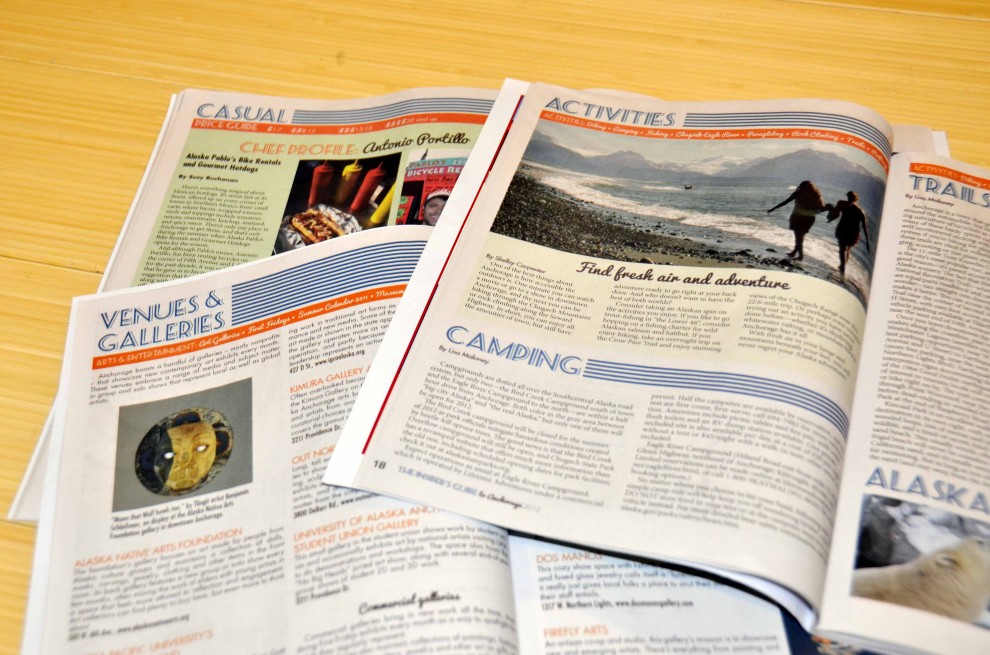
The Idaho Statesman

Publication Design

0214craigETHICS


Right out of college I was the front page designer at the Idaho Statesman where I was honored to working with a very talented crew of reporters, photographers, editors and designers. The forward thinking, alternative storytelling and maestro news team meetings  taught me so much about teamwork, collaborative design, info graphics and the future of news design. I was lucky to be there during a very exciting time when the news team was a Pulitzer Prize finalist for it’s coverage of Sen. Larry Craig, R-Idaho. My cover designs from this time won first place in news design from the Idaho Press Club.

Front070807

091808econ

airquality

0704bizHonda1

Hot off the Press: The Insider’s Guide to Anchorage

Design, Publication Design, Visual Journalism

IG-Cover-copy-990x823

I didn’t grab my copy of the Anchorage Press last week until Sunday afternoon during a leisurely trip to Girdwood for a little lunch and exploration. So I was pretty pleased when I sat down at a restaurant with a copy of the press and the Insider’s Guide slid out. This is one of my most recent projects. I had a great time working with the wonderful folks at the Anchorage’s alt weekly on their combined visitor guide and restaurant special — Cuisine Scene. The visual theme was inspired by nautical and map design with some seersucker stripes and a splash of neon — an ode the the  bizarre combinations of lime, teal and tangerine I have been seeing and crushing on lately.

What are those lovely fonts?

Why they are called Seaside Resort, Pacifico and Futura.

IG-Inside-pages-copy-990x655

First Alaskans: Kick start spring with April-May 2012

Design, Publication Design

There are still plenty copies of the current edition of First Alaskans, but I’m busy plugging away at the next issue. Before it’s replaced with the next edition, I wanted to share some of my favorite pages. We gave the magazine a mini design facelift this edition with one new font and a few eliminated to streamline the look and make the design cleaner, more modern. You might also notice new department labels that display the word “Our” in a circle, one of many little changes as the magazine truly makes itself at home with First Alaskans Institute’s vision. Instead of “Traditional Food” and “Native health” new department labels speak like an insider, not observer of Alaska Native culture — Our Culture, Our Health, etc. I’m continually proud of the work we do here with this publication. Now back to get back to designing the next edition!